Value drawing
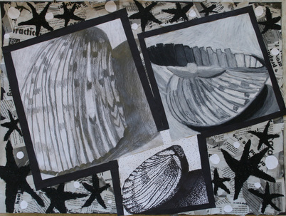
I think the oil pastel square has the best range of values because it shows the shell going from light to dark colors. I enjoyed using pencil the most because if you made a mistake you could erase it. The pencil square is the most interesting to me because the shell looks very textured. This drawing reflects my personal style because I love when drawings look neat and have straight lines. I think i was successful in the execution of the drawing because i like the range of value each drawing shows and the drawings really pop. In the project i learned that you can make objects look the same even when using 3 different mediums.
I think the oil pastel square has the best range of values because it shows the shell going from light to dark colors. I enjoyed using pencil the most because if you made a mistake you could erase it. The pencil square is the most interesting to me because the shell looks very textured. This drawing reflects my personal style because I love when drawings look neat and have straight lines. I think i was successful in the execution of the drawing because i like the range of value each drawing shows and the drawings really pop. In the project i learned that you can make objects look the same even when using 3 different mediums.
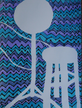
This project has many examples of elements of art and principles of design. I only used the colors dark blue, light blue, and purple which are known as cool colors. I made this drawing look like it has texture by making the lines zig zag so they pop off the paper . I used negative space witch makes the chair and light look like its coming off the paper.
